


Bore to Soar in seconds!
🚀 Secrets to Forms that truly convert better than ever!

Howdy Readers🥰

Balancing the marketing equation: Ads we love to create vs. the ad-free experience users crave. 🤔💊
In this newsletter, you will find:
🌟 Transform Your Contact Form From “Boring To Soaring”
🤩 Maximizing Conversions With Microsoft's Audience Ads
📩 Google’s Stricter Measures For Mass Email Sends via Gmail
🌟 Transform Your Contact Form From “Boring To Soaring”
Insights from Formidable Forms & CallRail
Only 37.85% of contact forms are completed after they're initiated, highlighting the challenge of engaging users effectively. Often overlooked, contact forms are the unsung heroes of lead generation. Yet, a generic form hardly does justice to potential customers eager to connect.
The Reality Check: Contact forms are goldmines for capturing motivated leads. Visitors in the "Contact" section are already intrigued by your offerings. But a generic form can kill their enthusiasm and your conversion rates.
Here's Your Game Plan:
Tip 1: Simplify your form
→ Keep the questions to 3 or fewer!
Research proves that forms with 3 fields or fewer have the best conversion rates. On the flip side, the more fields you add (especially more than 5), the more you confuse users and increase the chance of errors.
A smart strategy? Trim the fat. Remove unnecessary details, especially personal ones like last names or phone numbers because they find it cringy. And if your biggest challenge is lead generation, you don’t want to miss giving a good user experience, because 63% of businesses out there have the same challenge ⬇️
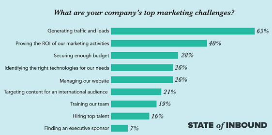
Image Source: WPforms
→ Make Your Brand Appealing
Your form isn’t just for gathering data; it’s a branding opportunity. Consider DemoStack, by removing just ONE field (company name) from their form, they saw a whopping $12 million increase in profit. And by simply making the phone number field “optional,” their conversion rate skyrocketed from 42.6% to an impressive 80%📈
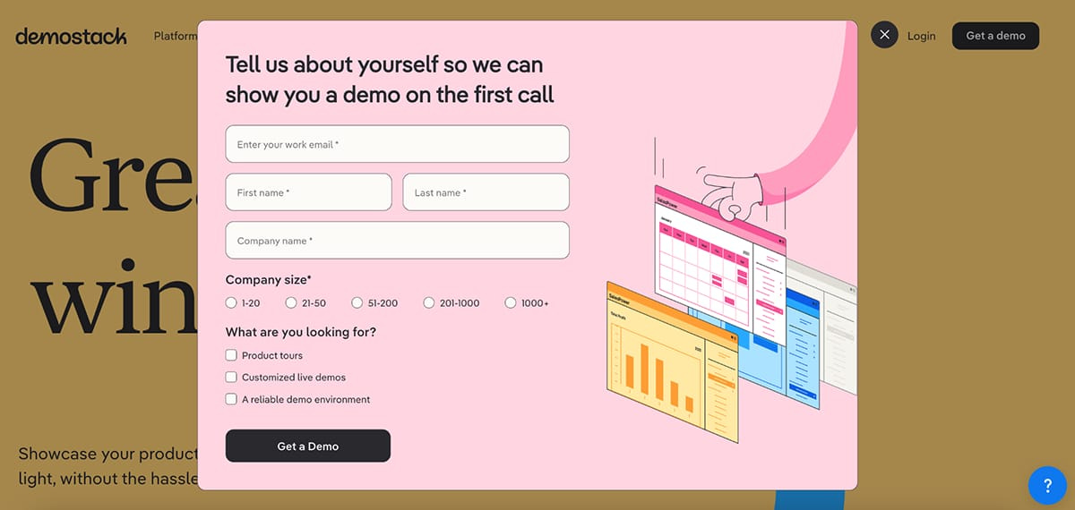
Image Source: Visme
→ Explain why you need more:
For demos or detailed quotes, more form fields are okay. Just explain why you need that information for a more personalized experience.
Utilize Multi-step forms, especially for complex information, and design the form for mobile users first.📱
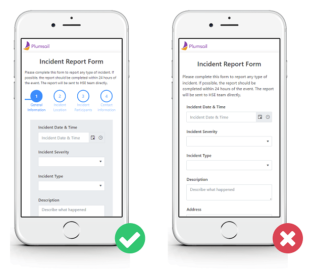
Image Source: Plumsail
Tip 2: Add a bit of Spice
→ Remove The Doubt <